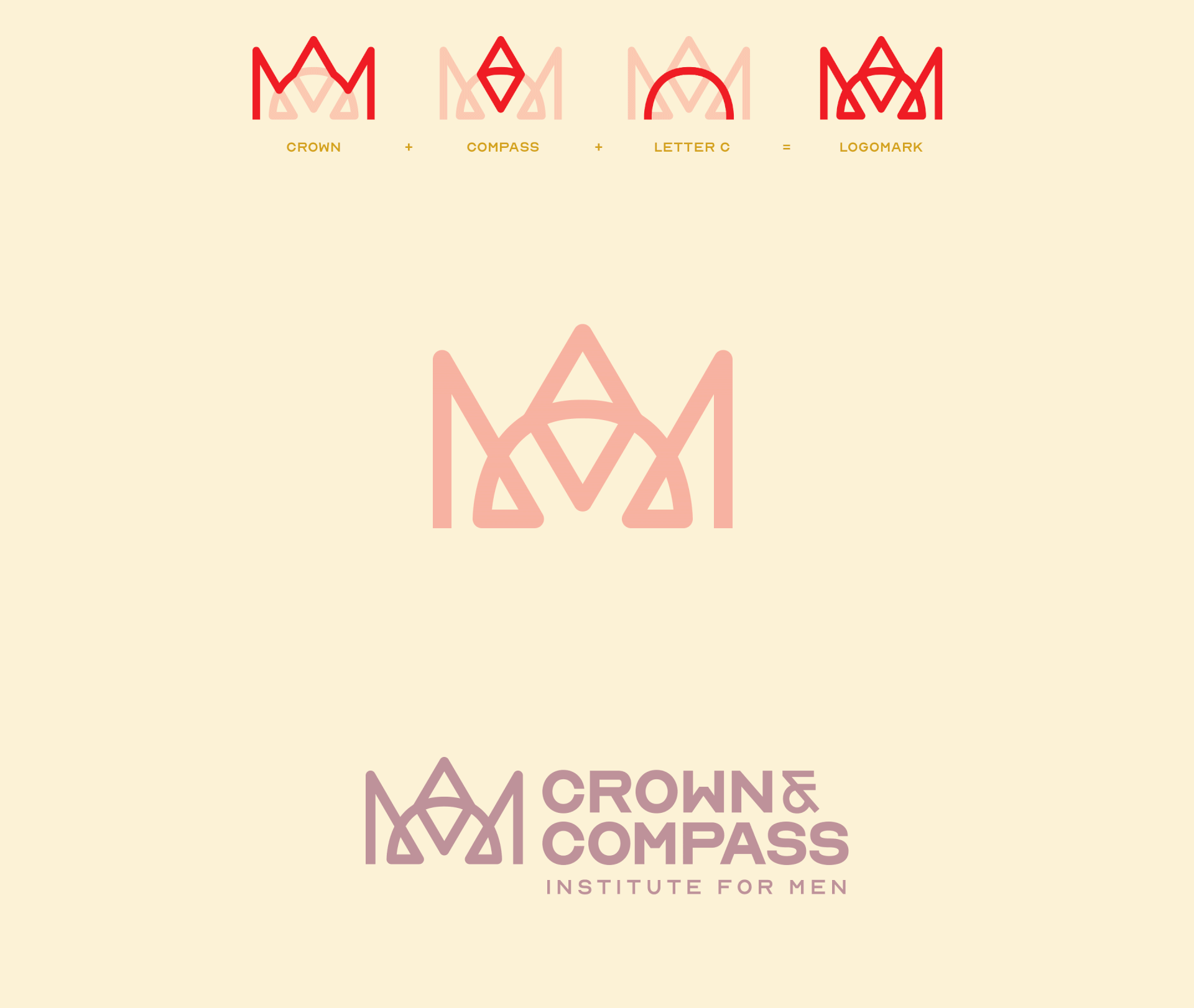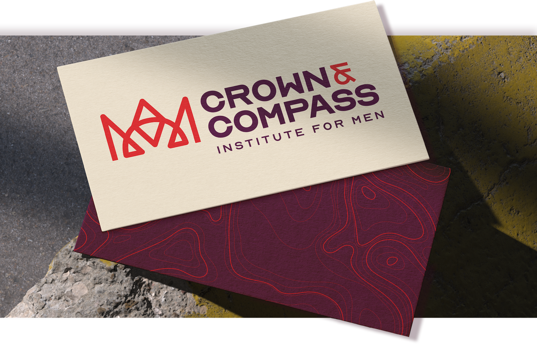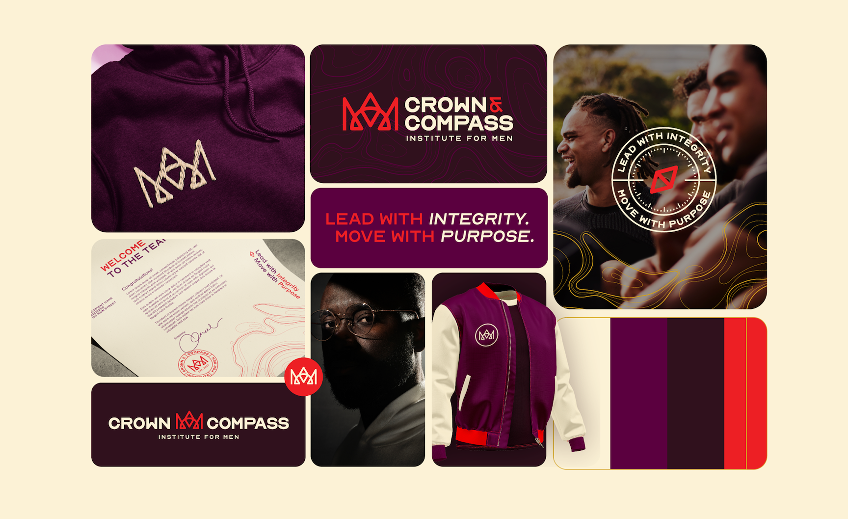

Brand Identity Concept
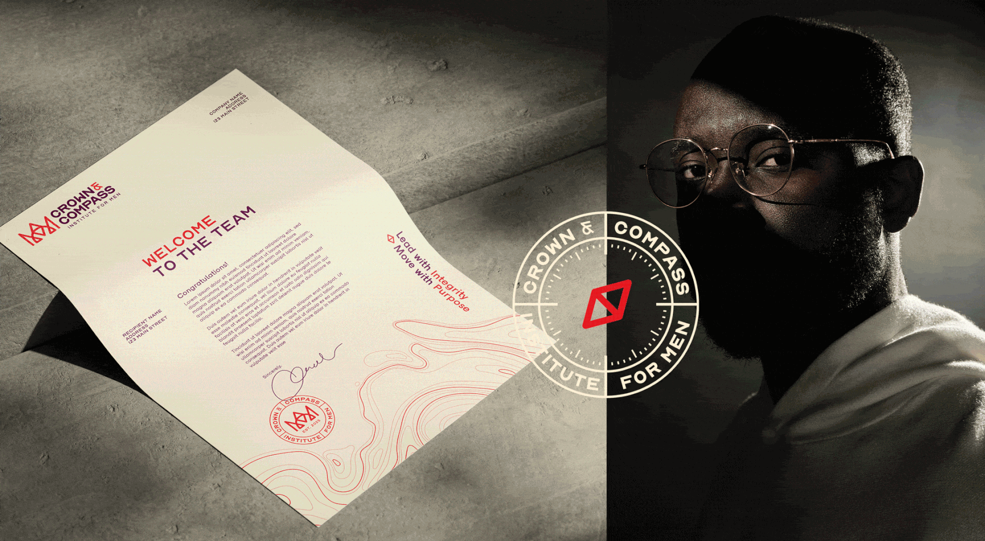
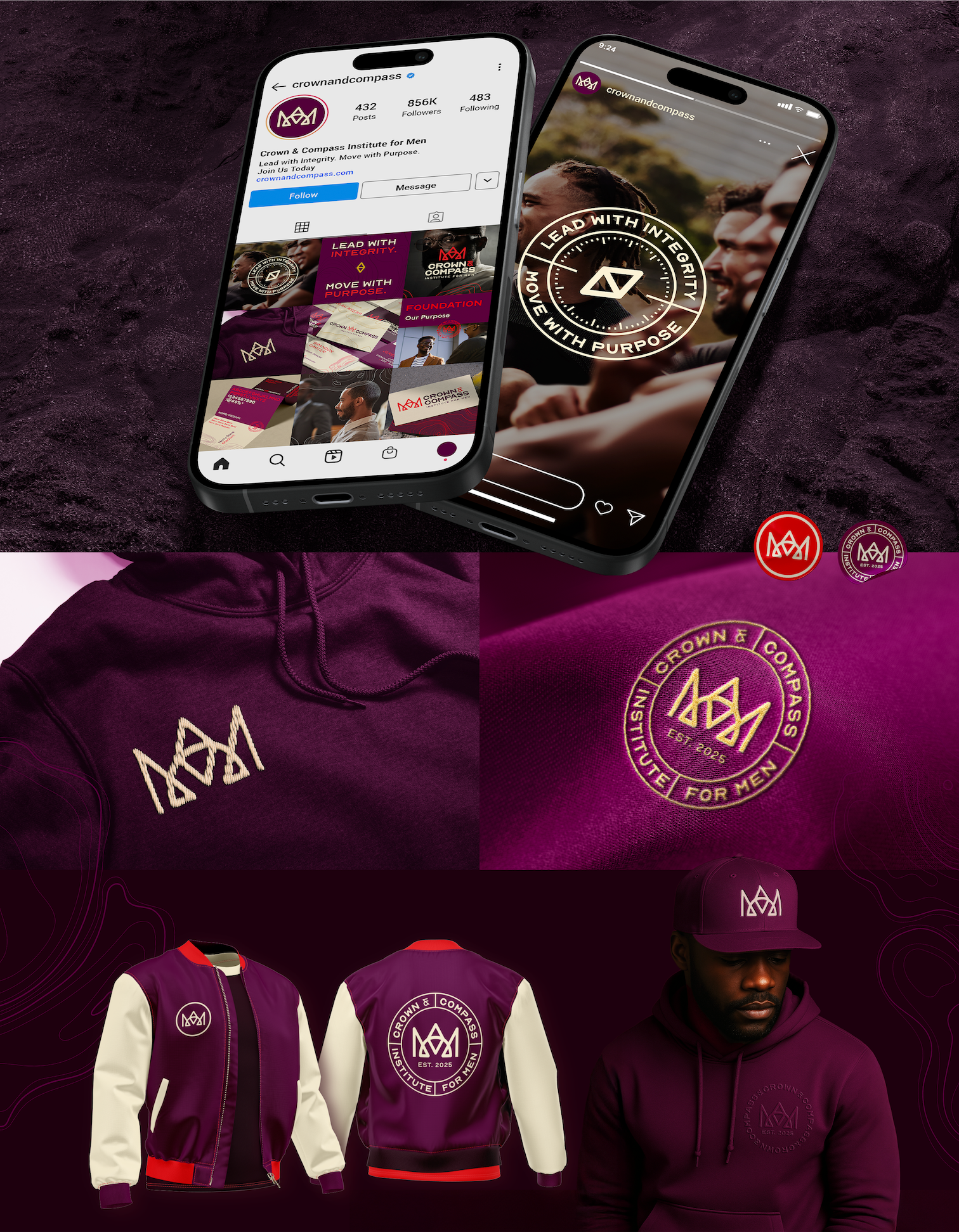
The goal was to translate the brand’s values into a visual identity that felt sophisticated and elegant, yet striking. The design needed to communicate a bold, masculine presence while remaining approachable, motivational, and empathetic. The aim was to create an aesthetic that was both distinctive and timeless; something participants would be proud to wear on apparel and merchandise long after completing the program.
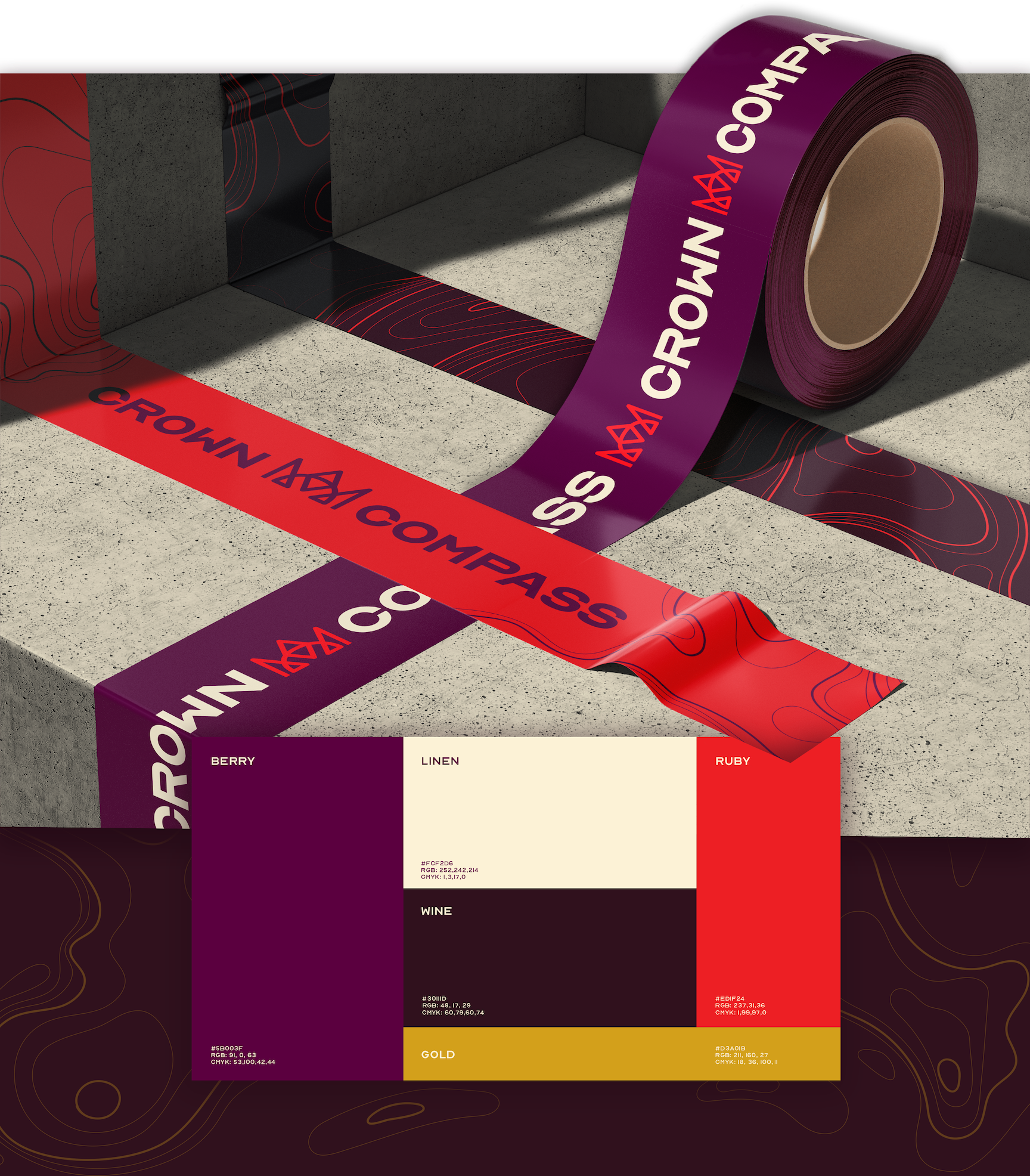
Nord is the primary typeface that reflects the brand’s confident personality with it’s structured, capitalized letterforms. Its name also represents “north.” alluding to the compass directions.
Naru is the secondary typeface that speaks to the welcoming, approachable nature of the brand, and contrasts Nord with its rounded letterforms.
Naru is the secondary typeface that speaks to the welcoming, approachable nature of the brand, and contrasts Nord with its rounded letterforms.
Core Values
Purpose
Brotherhood
Integrity
Transformation
Courage